As 2016 quickly draws to a close (and what a year it was!), it’s time to turn our eye towards next year and what new and mysterious trends we’re going to expect moving into the new year. Web design is kind of like multi-tasking – you can do one job, do it well and end up with something that works and does the job well, or you can add a flourish here and there and come up with something that pushes the borders of industry standards, or you can try too hard and made something beautiful that kills the user experience by overwhelming them, like this one.
Obviously, design trends are always changing and that’s why we try our best to keep up and continually improve, or else you end up with site’s that look exactly like they did in the 1990s. The less said about that, the better…
Without further ado let’s get stuck into the trends that we’ve identified for 2017!
Table of Contents
Toggle1. Mobile first approach to design
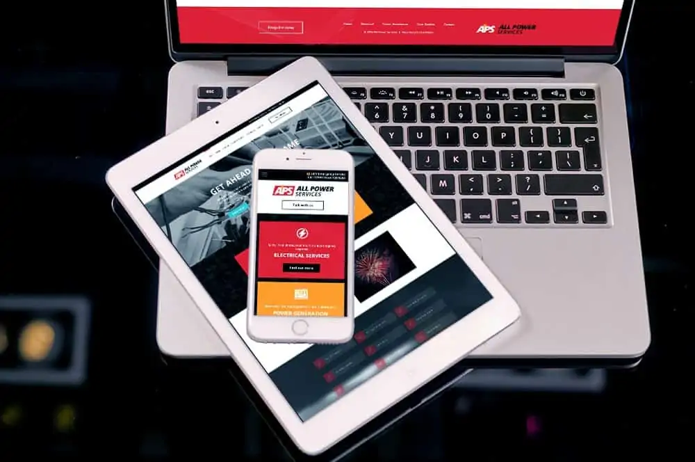
Ok, yeah we get it, mobile isn’t new. Responsive design isn’t even new, but it’s more important now than it ever has been. Google has announced that it’s going to be preferencing websites that are mobile-friendly when it comes to SEO.
On top of that, as more and more users are accessing the web via mobile devices it’s important that we provide them with the best user experience (UX) possible! While this isn’t a new trend, it has been around for a number of years now with responsive design. Smartphones generally have smaller screens than a tablet or desktop computer which limit what the user can view at one time.
2. Courageous colours
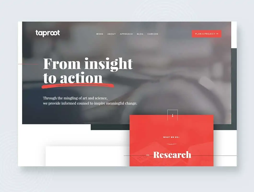
Duo tones have really come to the fore when it comes to web design. As we focus more on user resonance by implementing hero backgrounds, duo tones allow designers to use impactful images without distracting the user with an overload of colours or making text illegible.
As minimalist & flat designs have gained popularity of late, bright colours have been on the rise too which has led to the growing trend of duo tone colour schemes for hero images.
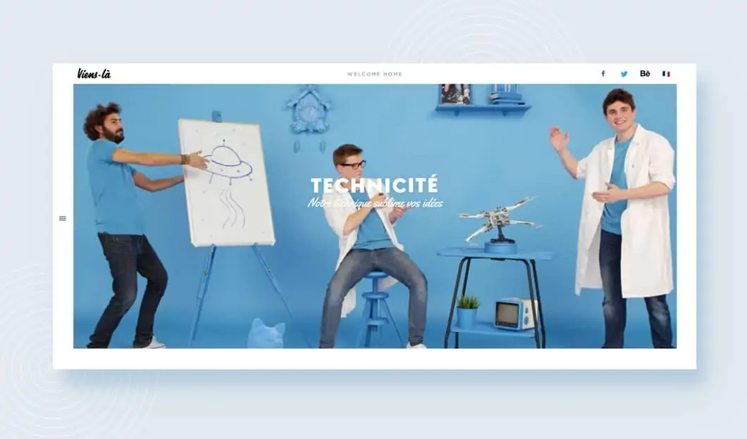
In addition to this, the bright palettes that are increasingly being used in design can have a strong brand effect. Google has it’s typical primary colour palette of blue, red and green, Facebook has it’s vibrant, deep blue and Excite Media has it’s enthusiastic and fresh green! These bright colour palettes help designers craft beautiful, engaging and powerful websites which draw in users and address the key purpose of the site.
3. Shadows and Material Design
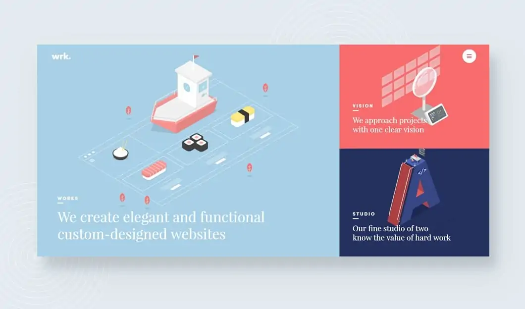
Alright, flat design has re-emerged as a bit of a trend in recent years 2D shapes are the new ‘in thing’. But the new new ‘in thing’ is 3D shapes! Some genius (that was not sarcasm) thought ‘what if we improved flat design by adding layers and depth of field while still keeping things flat?’.
This idea brought about some clever play with large-coloured shadows which use dimension and depth of field to signpost interactive elements for users. Using shadow in this way allows signifcantly improves user experience through usability improvements and a more modern visual aesthetic. Moreover, it adds a life-like quality to interfaces which can seem alienating and bland.
4. Long-form page design and scrolling
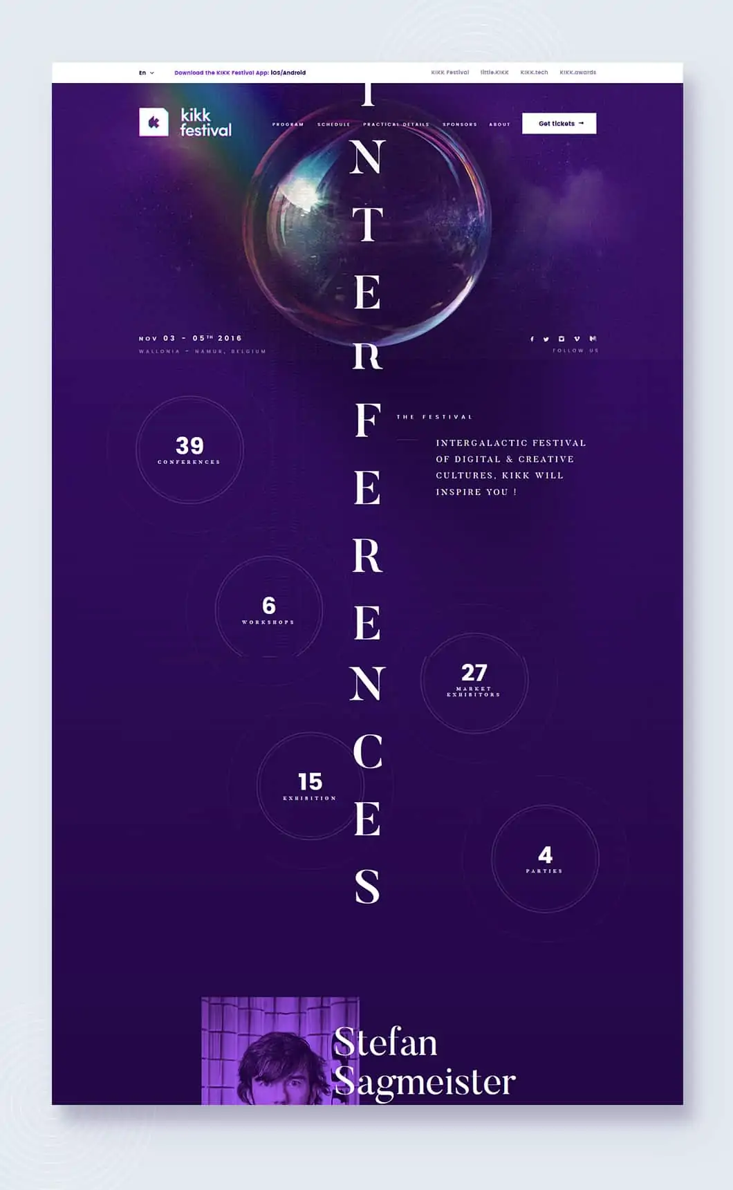
Recent trends in design and Conversion Rate Optimisation (CRO) have focused on addressing users and grabbing attention with ‘above the fold’ design. This basically means that users don’t have to scroll below the part of a page that appears on their screen when they land on a page to know what to expect from the rest of the page.
While this doesn’t mean that it’s thrown out the window, recent research has shown that user engagement is sustained over increasingly longer pages. Users are increasingly less psyched to navigate multiple pages of a site.
So webmasters and developers are making their dreams come true by shoehorning loads of content onto one page.
Naturally, designers just have to adjust or risk being left behind! However, long scrolling opens the door for better approaches to narrative and simpler interaction models.
5. Broken grid layouts
So kind of the same idea as flat design, grid layouts became in vogue around the same time as flat, minimalist design. However designers are increasingly stepping away from the same, same but different grid design and one of the ways this is happening is in broken grid layouts.
Broken grid layouts are hard to pull off well. They destabilise the structure of a site which means that creating a design which scaffolds user expectations is incredibly tricky. However, this approach creates beautifully symmetrical and simplistic sites which maintain minimalist design standards while stoppering user yawns.
As with every design, it’s so important that your design is on brand – broken grids may not be on brand for RTOs or tradespeople but businesses that are innovators, startups, or something outside the box can really leverage this trend well! Broken grid layouts can visually communicate that sense of fluidity and innovation that is so innate in these sorts of businesses.
6. Strong visuals over text
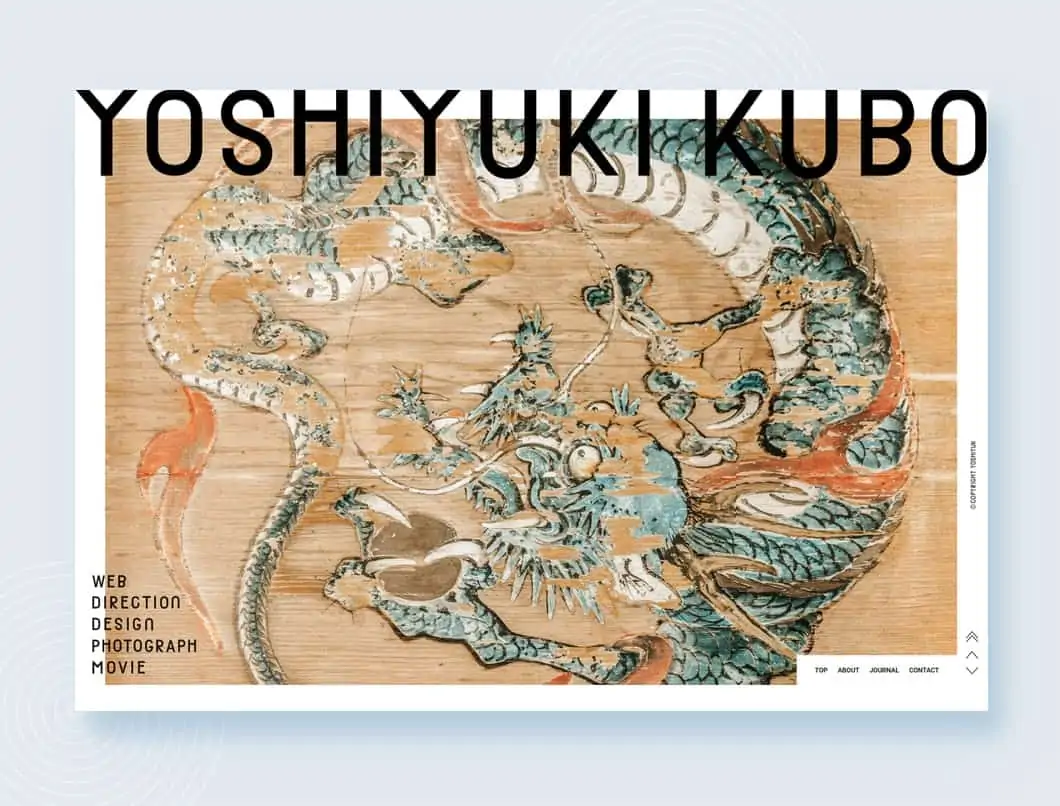
A picture is worth a thousand words right? Wrong. It’s more like a picture is a picture and words are words. The problem is that all users resonate differently with different methods of communication. Which means if you’re relying on images or words too heavily over other types of content then you’re doing it wrong.
Images are truly great pieces of content and communicate amazing messages easily, they are also obviously critical elements of good web design. Solid copy is always great, but if you can reinforce that message with a visual element then you can kill two, or even three, birds with one stone.
Increasingly designers are relying on high-quality static imagery over carousels and rotating banners because:
a) Users just don’t click on carousels (source) and
b) They’re really rubbish for SEO
It’s important to note that as wonderful as images are, they will kill your SEO if you don’t set the alt text and title accurately. However, a good designer will make sure that images are content relevant which makes it easier to optimise for SEO.
7. Storytelling
Consumers are increasingly being driven towards businesses by understanding and connecting with the provenance of that business. It’s about businesses trying to connect with their clients and customers on a more human level.
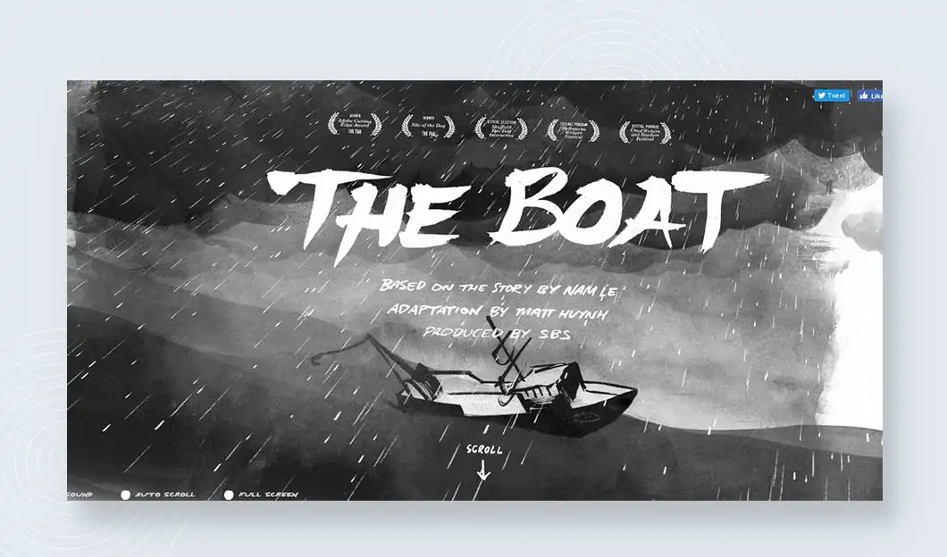
Web design is starting to pick up on this narratological approach to B2C relationships and some of the best sites are using graphics and text to take users on interactive brand journeys.
This element brings a depth of field and real grit and substance to the stories that businesses attempt to communicate.
This tendency dovetails with the trend toward long-scroll and long-form content coupled with responsive design which allows businesses to communicate in a variety of ways to a range of user types through one dynamic portal – their website.
8. Rich animations
Last, but certainly not least, rich animations are another way that designers can engage with users and prospects. Early on in web design animations were over-used and to ill affect, often nauseatingly. Remember those swirling animations on text or fade-ins? *insert fake vomiting sound here*
Fortunately, we’ve all come to our senses! Designers are now using animations to communicate with users during load times or to create interesting hover states to spice up the user experience. This type of emotion often attracts users attention but it needs to be used sparingly and cleverly to ensure it doesn’t distract from the overall effect of the site. Here are a couple of sites we are particularly fond of: aquatilis.tv, cappen.com and benoitchalland.com.
Bring on 2017!
That’s a fair bit of information to digest and a lot for designers to keep in mind, but we say bring it on! We’re always happy to take on a challenge and can’t wait to see what new design trends will be affecting the way we build and design sites for our clients.

