
This blog post was originally going to be titled ‘The Second Most Important Page on Your Website (spoiler: it’s the ‘About’ page).’
We were going to talk about how essential it is to get your ‘About’ page right. We were going to tell you how your ‘About’ page isn’t about you. It’s about the person viewing your website and how you can solve their problems and improve their lives.
The blog post was Scott’s idea. It had come off the back of a few clients asking if they should even have this page, whether people visit it, and what the point of it is.
So, we sat down with him to pick his brain about the idea and ask from his perspective, “What makes the perfect ‘About’ page?”
He rattled off loads of good points: proof, our process, success stories, your “why”. But then, he said, “Well, what’s on our ‘About’ page?”
That’s when we realised: it was going to be pretty important that we revamp our own ‘About’ page before we start preaching to you about it 😅
Our ‘About’ page already shared who we are, what we do, and why we do it. The words made sense, and it was about us while still really being about you, the potential client.
It just didn’t tick the boxes for keeping the user engaged and guiding them through those points, without their noticing.
So, we put this blog post on the back burner and focused on redoing our own ‘About’ page. The best bit, though?
We’re going to take you through exactly how we did it 👇
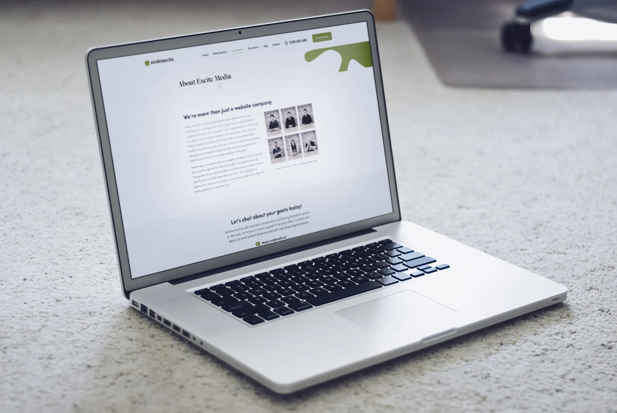
Table of Contents
ToggleThe very first step: what is it that our clients like about us? 🥰
To work out exactly what our potential clients might want to hear from us, we decided to work backwards by finding out what it is our existing clients like about us.
So, we hit our Google reviews and found the most common themes, words, and phrases.
Here’s what we found, starting with the most frequent themes to the less frequent:
- Professional
- Personal approach
- Responsive
- Customer support
- Expertise/knowledgeable
- Timely manner
- Friendly
- Creative
- Smooth processes
- Results-driven
Some phrases that popped up were:
- Nailed the design
- Trust for quality outcomes
- Seamless, stress-free experience
- First and foremost, Excite are great people, makes working with them so much easier
- Extremely responsive
- Always understand what we need and nothing is too much trouble
- They “get” business and what they do works. The results speak for themselves.
How do we want our clients to feel about us after reading our About page? 🧪
What our existing clients think is one thing. How we want our audience to feel after reading our ‘About’ page is another thing entirely.
So, we had a brainstorm.
We decided that, ultimately, we want our audience to think we’re approachable and friendly, while still being knowledgeable and experts in our craft.
When it comes to giving your audience hints about who you are as a company, though, it’s all about showing, not telling.
So, we had to inject that friendliness and approachability into our tone of voice and the messaging behind our words.
Your ‘About Us’ page tells your audience a whole lot about you. If you’re corporate on the page, they expect a corporate company. On the flip side, a casual and relaxed page will usually lead to a relaxed business.
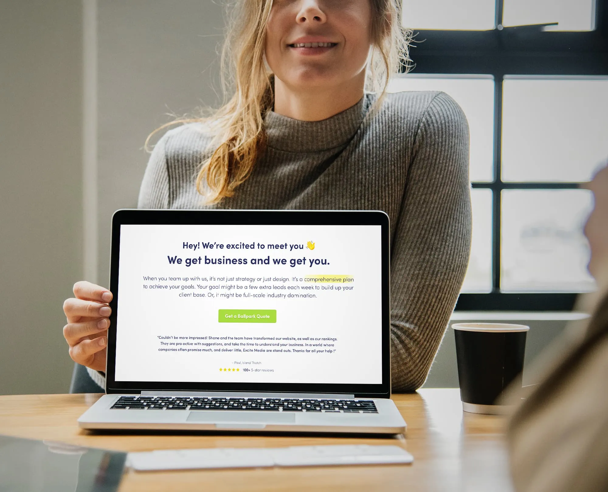
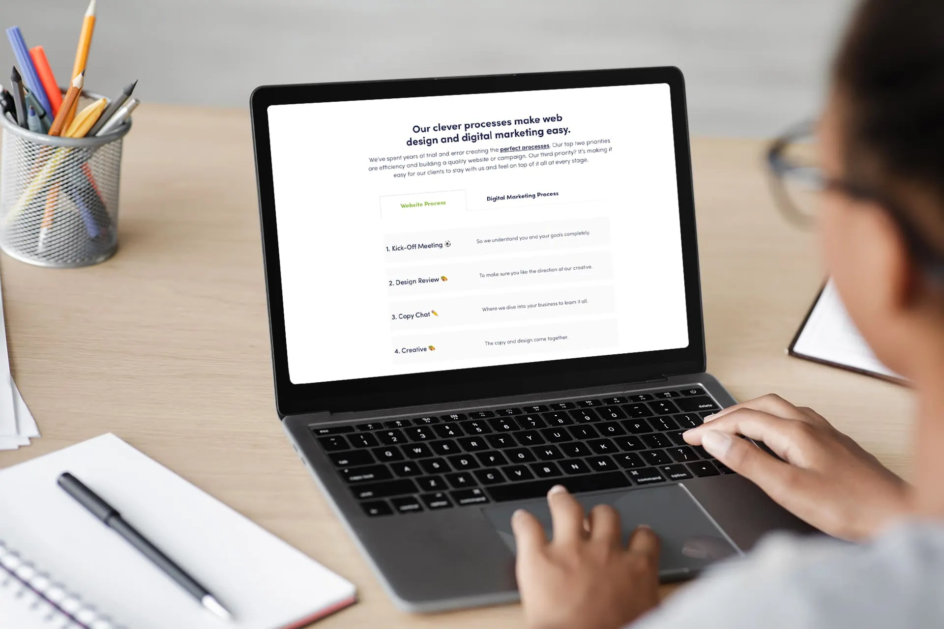
You can see below how we’ve tied both what our customers rave about and how we want to be seen together. It’s relaxed and fun to show our approachability. It’s conversational because we’re a friendly team. And the messaging is all about our knack for results.
Every second someone spends on your website is about them making a decision ⚖️
That decision-making process will look a little different for everyone, but for the most part, your website visitor is going through a mental checklist as they navigate your website.
They want to know that you’ll do what the others won’t. They want to know they won’t regret choosing you. But the specifics of why they should choose you are so dependent on your industry, the service you provide, and which kinds of clients you want to attract.
Everyone is going to claim they have great customer service, that they have experience and qualifications, and that they’re efficient and effective. You’d have to be out of your mind to claim anything different 😬
But to stand out, be specific about your service – what is it that makes your service that good? You’re experienced; how does that translate to your customer’s experience? Does it mean you can solve any problem because you’ve seen it all?
The more obvious the statement you make is, the more proof you’ll need to back it up, to differentiate your business. And not every business, no matter how similar they are, needs to have the same benefits.
One business could say they take the time to develop a deep understanding of your business and what you’re trying to achieve before they even get started. And that’s definitely a selling point for some clientele.
But another business could say the opposite. They might say, “We avoid the fluff and get straight into building your campaign, so the wheels are in motion before you can even blink!”
These are two completely opposite benefits – but they both work and speak to a specific kind of client.
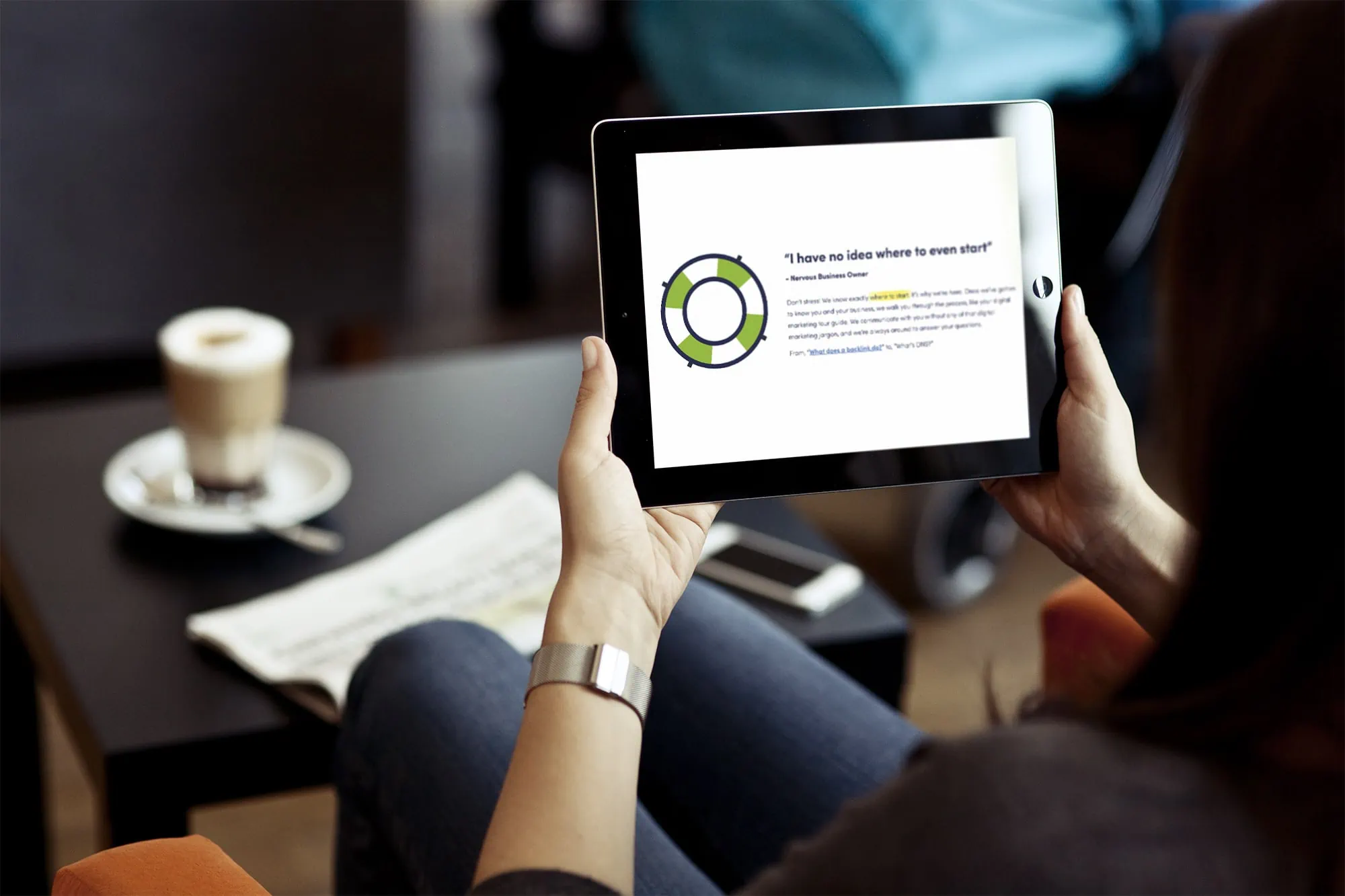
“I have no idea where to even start” – Nervous Business Owner. This is a heading that came from putting ourselves in the shoes of our customers.
Whether it’s a new website or a pending digital marketing campaign, this is often who we meet. A business owner who knows exactly what they’re doing in their business and knows they need digital marketing, but it’s a foreign world for them. They’re overwhelmed, the acronyms are getting confusing, and they just want someone who’ll make it easy for them.
So here, we’re playing on exactly how they’re feeling while introducing Excite Media as the team that’ll make it easy-peasy.
It’s not just about the words, though 🎨
Especially on your ‘About Us’ page, it’s not just the words that engage your audience and share who you are. The design choices and imagery can go a long, long way.
The imagery backs up the text. A wall of text is going to be overwhelming, and when faced with it, most people will probably click away. No one wants to read an essay.
By introducing plenty of imagery, you can keep the page engaging while showing exactly who you are and what you do.
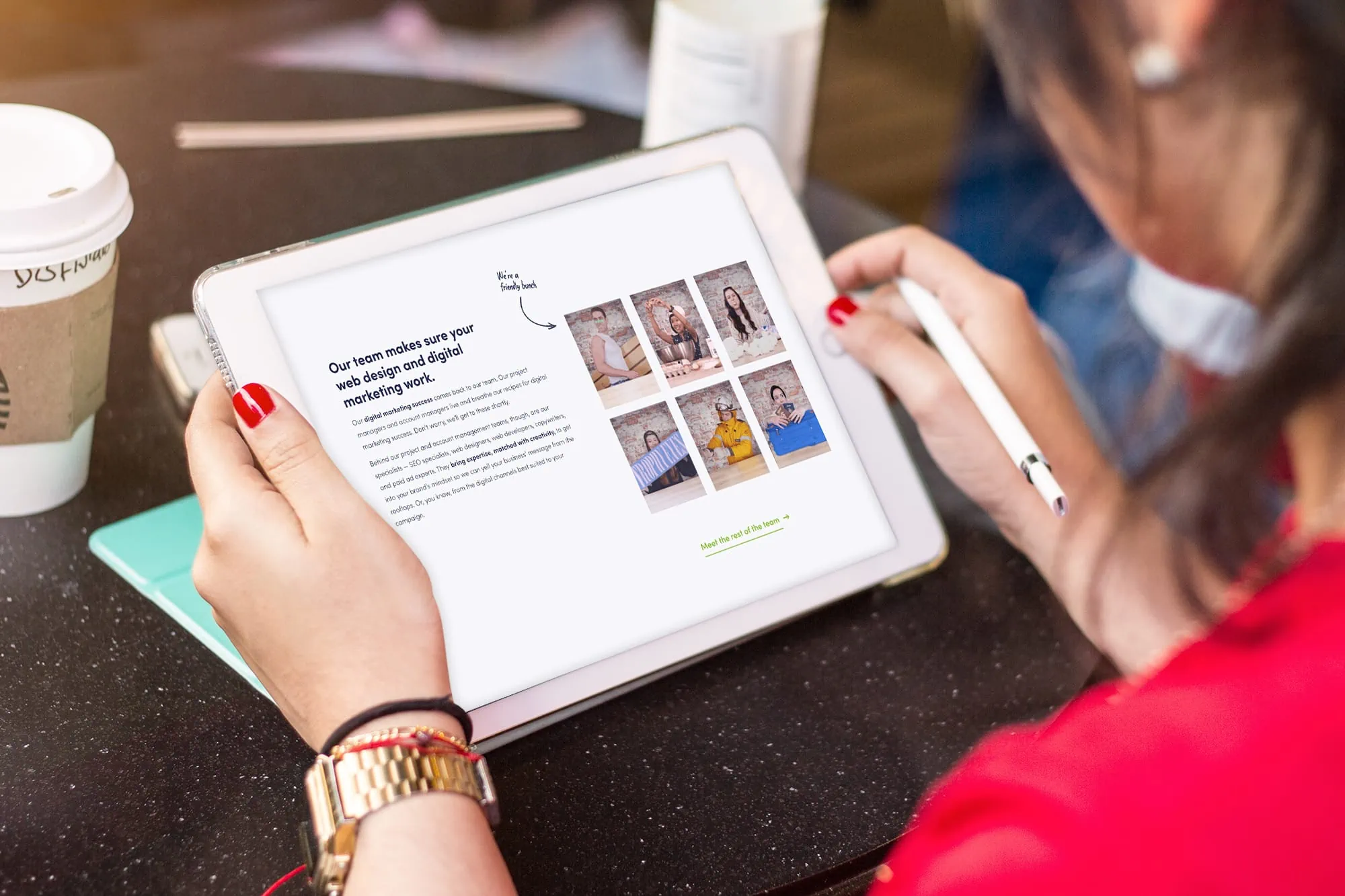
You’ll notice there are a bunch of photos on our ‘About Us’ page. So many so, that they’ve been craftily collaged together down the side of the page.
They’re not stock photos, though. They’re real-life photos of our real-life team. These photos aren’t the highest resolution or quality – they’re photos we’ve snapped in fun team moments.
These photos are really powerful, though. By showing the real faces behind your team, you can resonate with your audience, humanise your brand, and create a connection, before they’ve even signed up for your services.
This team section is an awesome example of combining important messaging with engaging imagery. It’s a panel describing how the breadth and experience of our team mean we take a comprehensive approach to websites and marketing.
We’ve matched it with a few fun photos of our team, demonstrating our friendliness as well as our creativity. It allows our audience to form a connection with us – before we’ve even met.
The layout counts 🧭
You’ll notice throughout the entirety of our ‘About’ page, though, are descriptive headings. These headings mean that our audience could scroll through the page, skim the headings and look at the pictures, and still get the gist.
We have calls to action (CTAs) scattered throughout the page, as well.
Your ‘About’ page isn’t necessarily designed for the hard sell. But it is a page that can take the fence sitters across the line.
The CTAs don’t need to be super persuasive or in your audience’s faces. You’ll notice ours are mostly light suggestions to navigate around the site.
We encourage our ‘About’ page visitors to see our full ‘Team’ page and take a look at our Code of Ethics – two pages we think really matter when it comes to getting to know Excite Media and understanding why you’d choose us.
Of course, we also provide the option to get a quote throughout, just in case they’re ready to take action.
Put yourself in your customers' shoes 🥾
Basically, any business out there should be focused on being a client-centric business. You’re there to solve your audience’s problems – so make those benefits clear.
Jump into your customers’ shoes and think about what they want to see. What are their problems? What are their questions? What about their objections to needing your services?
Solve their problems, answer their questions, and (respectfully) clap back to their objections.
For us, a big question mark around both websites and marketing is how it all works. Our customers usually feel a little overwhelmed by the process of getting started.
By showing off our process, we don’t just explain how it all works, but we show the benefits of choosing us. We’re thorough, we think it through, we’re accountable to the client, and we offer an opportunity for the client to weigh in.
Building confidence in you and your business 🧱
Some good questions to think about when you’re drafting your new ‘About’ page are these:
- Where are you located?
- How long have you been in business?
- Who’s on the team? How big is it? (Ie. are you small and agile or large and able to tackle it all?)
- What social media are you on, and why should your audience follow you?
- Where do you service?
- What experience and qualifications does your team hold?
- What do you have that proves you can deliver? Do you have case studies? Testimonials?
It’s all about backing it up. You can say you have great service, but tell us why. You can talk about your successful projects, but you need to show how they were successful. Of course, talk up how much your clients like you, but make sure you back it up with proof.
Avoid clichés, too. Plenty of businesses say they’re a leading company in their industry, they have great customer service, and they produce results.
Anyone can say these things, though. It’s the proof that backs it up. That proof can be testimonials, case studies, or industry awards.
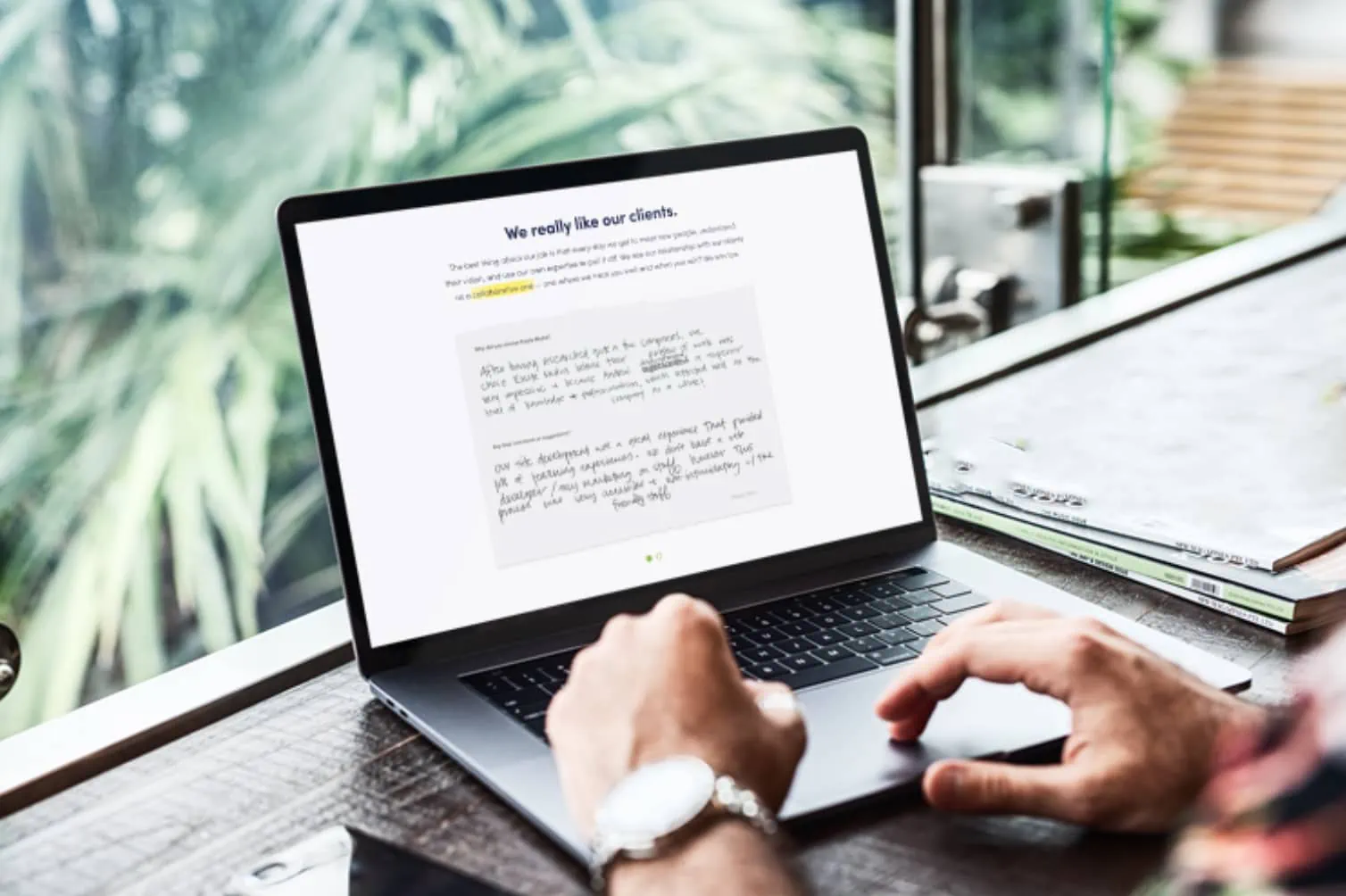
So, instead of buzzwords like ‘leading’ or ‘results’, we’ve included a panel on our ‘About Us’ page that points to our handwritten testimonials from our clients, and our Code of Ethics.
Show your passion and your purpose 🔥
Why are you in business? Explain to your customers why you’re so passionate about what you do (tying it all back to that confidence building).
It’s the sharing of values and the story behind your business that can really drive a connection with your audience.
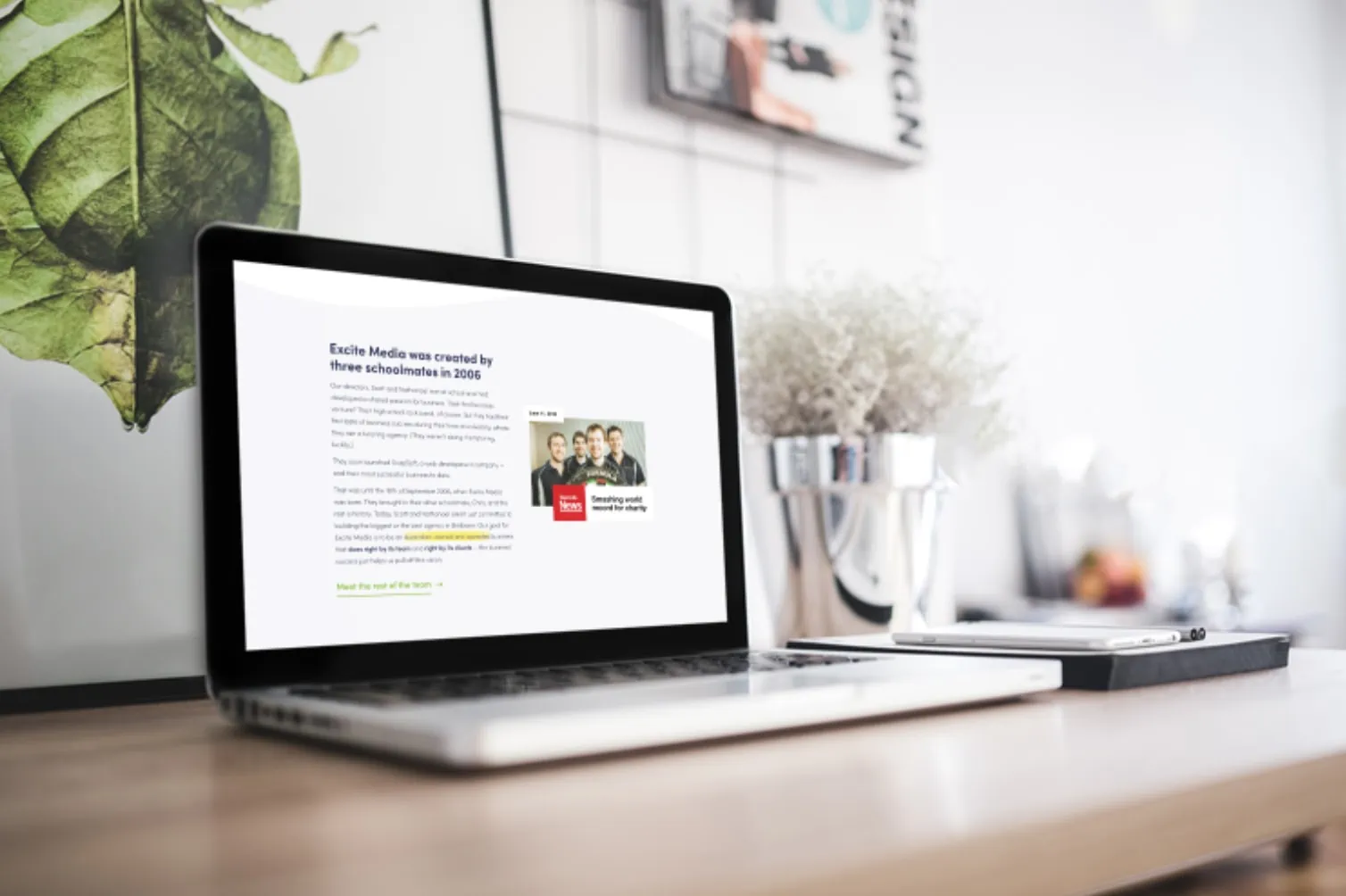
We’ve incorporated important pieces of our history into the page. It shows where we started, where we’re going, and why it matters to us.
“Today, Scott and Nathanael aren’t just committed to building the biggest or the best agency in Brisbane. Our goal for Excite Media is to be an Australian-owned and operated business that does right by its team and right by its clients — the business’ success just helps us pull off this vision.”
Accompanying that history is snippets from where we’ve been featured in the news. It points to our fun culture, our commitment to giving back to the community, and it shows more of our story.
Show them who you are, too.
When we talk about hiring for our business, we’re often looking at our culture. We want to know that our new team members are going to be an excellent cultural fit within our team.
Something we don’t talk about a lot is that our clients want the same. When your audience lands on your website, they want to know you share the same values as them.
There’s so much value in being a relatable business, one that your dream customer wants to become a part of and invite into their own business, too.
So, our ‘About Us’ page is completed with a bit about our team’s culture. When you read through it, though, you’ll notice that while it seems like it’s about us, it’s actually about the client.
Our team members liking each other is actually about how good we are at collaborating.
“Our team really likes each other… but what does that have to do with you? Well, it means our projects are more efficient, ‘cause we really like working with each other.”
Our value, ‘Fun’ is about the quality of the work we produce, taking it from something about us to something that’s about them.
“When we have fun and enjoy each other’s company, everyone’s moods lift, which leads to better productivity and, usually, better work.”
Our taco-gratification-system? Well, that’s how we encourage each other to do good work for you, the client.
“Showering each other in tacos every day gives us all the warm and fuzzies, but it makes us remember our values and all the little things that make a big impact.”
Some tips to take away 🥡
Be specific
Don’t make sweeping statements or generalisations. You can say you have great customer service, but back it up with how and why
Get personal
Share real photos of your team, tell them who you are, and be genuine in the content you put forward.
Step into their shoes
Your ‘About’ page should basically be reverse-engineered. Start with why your clients like you and what they’re looking for. Then, create the page, putting those ideas forward. It’s all about resonating with your audience.
Next? Go take a look at the page and steal our ideas 💭
Ready to get inspired? Go take a look at our ‘About’ page or get in touch and leave it with us to create your ultimate ‘About’ page 😉