![[Case Study] How we designed the stunning new logo for Ingenuity](https://www.excitemedia.com.au/wp-content/uploads/ingenuity-blog-hero-1024x538.jpg.webp)
A business’s logo is more than just a mark used to identify it. It is one of the most valuable and often overlooked assets that every company has at its disposal. It is the first impression a prospective client or new customer has of a business, a way to stand out from the competition in a crowded marketplace, and the foundation on which to build the entire brand.
Logos touch everything a company does, from business cards and billboards to the website and products themselves. Getting the logo wrong, or overlooking it altogether, can be a costly mistake. A logo is an integral part of any successful business, and when done correctly, can make a business more profitable.
Using this case study, we will demonstrate the steps that Excite Media take to ensure that our logo design projects avoid these pitfalls. Every mark we design is crafted through a thorough and systematic process to ensure not only that our clients love the final product, but most importantly, it can help them achieve their business goals.
Introducing Ingenuity Design
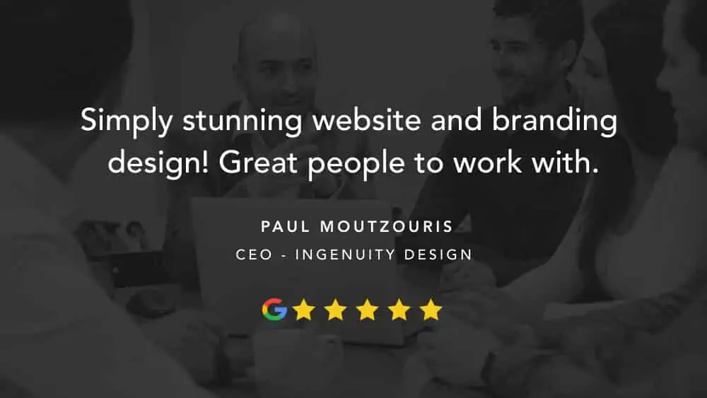
Ingenuity Design is a product development company based in Sydney, Australia. Founded in 2011 by entrepreneur Paul Moutzouris in a small office in Chatswood, they have since grown into an award-winning, multi-skilled agency of 200 plus staff. Spanning three Australian locations and three continents, Ingenuity most recently set their sights on conquering the USA with the opening of their Colorado office in 2019.
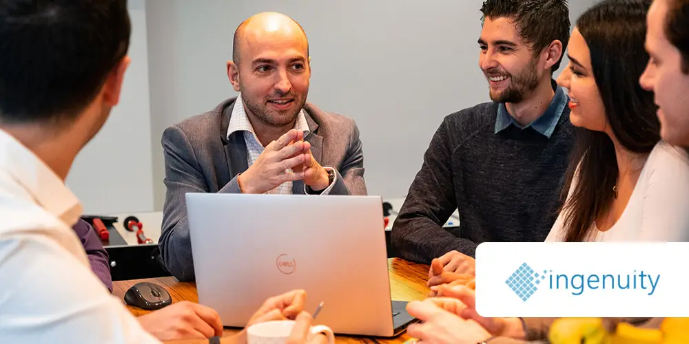
Ingenuity approached Excite Media last year intending to rebrand their growing business completely. The previous logo had served them well since their inception in 2011. Still, with the increasing success and ambitions for global expansion, Paul felt it was time for a fresh new look more befitting of their highly-skilled, award-winning reputation.

- Paul from Ingenuity in a meeting with his team.
Phase One: The Brief
At the outset of any new branding project, it is crucial to get a clear and detailed brief for our designers. Every project is different, and while some begin with a client’s clear vision from the outset, others require more of a dialogue to establish where the brand should go.
A detailed design brief not only guides our creatives to a solution that meets the project requirements but also acts as an essential point of reference as the design progresses.
Through each stage of the process, our team will check our progress against the client’s goals outlined in this brief, ensuring that every logo we create meets the three fundamental design principles:
- Simplicity – A great logo should be simple in its design. This approach allows the mark to age gracefully and enables consumers to recognise and recall its form easily. A clear and straightforward logo allows for it to be used effectively across any application, whether blown up on a billboard, embroidered on corporate apparel, or as a tiny favicon in an internet browser.
- Distinctiveness – Logos are designed with one main goal, to identify, not to communicate a message. It is therefore vital that a mark is unique and memorable to those who see it. A successful logo should set a business apart from those around it.
- Appropriateness – A logo must always be appropriate for its market and target audience. For example, sporting brands logos like Nike are bold and dynamic, whereas high fashion like Louis Vuitton is more subtle and refined. Differentiation is essential, but not at the expense of alienating a business from its consumers.
From the outset, Ingenuity Design was a fantastic client to work with, giving us all the ammunition we needed for a successful rebrand. In our initial meeting, Paul and his team sat down with the Excite Media designers, providing them with a wealth of in-depth information about their business, processes, future ambitions and the market in which they operate.
Obtaining such a broad and detailed overview of a client’s circumstances is extremely important. This information ensures we make informed decisions that meet their needs, and that every design we present ticks all of the right boxes to help their business succeed.
The Brief In A Nutshell: Create a logo that is simple yet distinctive for the innovative and industry-leading product development agency, Ingenuity. The mark should represent the human-centric focus of this rapidly growing Australian business, its products and their expanding global network.
The company uses cutting edge technology to create products and brands that transform cultures and improve lives. We will aim to produce a mark that is befitting of this unique approach to product development, bridging the gap between cutting edge technology and their people-focused culture.

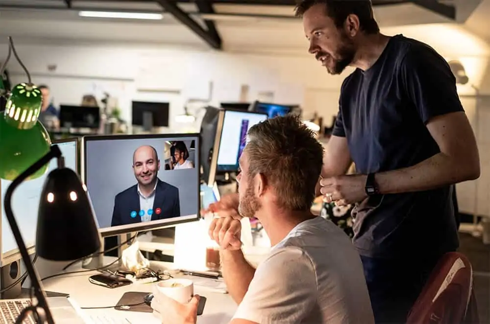
- A video call with Paul and our brand designer, Chris Harris.
Phase Two: Research & Planning
Before jumping straight in and putting pen to paper, it is crucial to take the time to digest the information provided by the client. The brief should guide our decision making, and often the smallest piece of information, when properly considered, can lead to a unique idea we may otherwise overlook.
We will start every new project by doing in-depth research into the market for which we are designing. This deep dive includes everything from colour psychology, competitor analysis, reading more about the business itself and evaluating success stories from similar companies around the world. Our research gives us a clear snapshot of the market and a firm basis on which to start putting together initial ideas.
With the homework done, it is time to make things visual. A great way to get the creative juices flowing and start to form ideas is mind mapping.
Ingenuity provided us with their new tagline; create, better, together, making a sound basis on which to begin this process. Putting all of these associated words on paper helps to explore abstract avenues that we can later translate into shapes, symbols and imagery, and the beginnings of our logo.

- A mind map created to explore ideas and abstract avenues that can later translate into shapes, symbols and imagery.
From here, we will often move on to creating stylescapes. These are, in essence, a more refined and highly curated version of a mood board.
The aim here is to capture in one place the colours, symbology, imagery and any inspiration that could come together to help guide the look and feel of the final brand. When done correctly, our final logo should be able to sit on this stylescape and seamlessly embody the elements around it.

- An example of a stylescape our team created for Ingenuity Design.
Phase Three: Initial Ideas & Internal Review
Now comes the fun part. With a well-considered design direction, visual queues, and brief to refer back to, we can begin to sketch out initial concepts. Rather than taking the first idea that pops into our head and refining it to perfection, it is best to spend some time putting as many ideas as we possibly can down on paper (or iPad).
These should be quick, rough and don’t even have to be good ideas at this stage. At the end of the process, one excellent solution is all we need, and by sketching many quick concepts, we help to uncover that rough diamond that could otherwise remain below the surface.
This pool of inspiration and ideas can also be useful to come back to at a later stage if one of the chosen concepts just isn’t quite working. Sometimes distancing yourself from a project for a short amount of time can help to clear creative block, returning with fresh eyes and a new perspective.
Once some ideas are on the board, and our designers have established the front runners, we find it beneficial to share these initial sketches with the internal team. With knowledge of the company and brief, but a fresh perspective, the Excite team, helps to spot any missed opportunities and refine existing concepts.
When a designer is working alone on a project, it is possible to get tunnel vision, so taking a step back to share ideas with their colleagues can alleviate this problem.
Before moving on to the next stage, our design team will pick their top three contenders, ensuring each concept is in line with the original brief. Although we want each logo to meet the same requirements, this initial round of designs is an opportunity to demonstrate different ways to achieve our goals.
There is rarely just one solution to a problem, so we like to pick three marks we believe meet the companies requirements in different ways. This approach keeps the options open and increases the chances of finding a logo that ticks all of the client’s boxes.

- Starting to sketch some ideas for the new brand
Phase Four: Refining & Presenting Initial Concepts
Now that we have our three chosen concepts, it is time to turn these rough sketches into high-quality vector art. We do this using graphic design software called Adobe Illustrator. Illustrator is the industry-standard tool for all things logo design and uses mathematical algorithms to create infinitely scalable precision artwork, essential for jobs of this kind.
With our sketches done on the iPad, we can quickly send these to a desktop computer for the heavy lifting. We can then import our designer’s illustrations into Adobe Illustrator where they act as a template over which we can trace our vector logo.
When designed well, we aim to create our logos by combining simple geometric shapes. We then piece these together to form unique marks of their own.

- Using geometric shapes that are already mathematically perfect ensures that our logos will meet these same principles, and remain pleasing to the eye.
We will always begin our designs in black and white. Ahead of anything else, it is essential to judge a logo based on its basic form. Colour is very emotive, so to view a logo free from this bias allows us to decide whether or not the mark is genuinely the right fit. Ensuring a logo works as a simple one colour silhouette is also important, as this added level of versatility enables it to be used effectively over photography, block colour and patterns.
Once we have converted our three chosen logos from rough sketches to refined vector graphics, they are nearly ready to present to the client.
Rather than showing a single version of the logo on a blank page we try to display our designs with as much context as possible, thinking about how the client may use that logo out in the world.
Presenting our ideas as multiple iterations including different dimensions and colours, as well as mockups of the logo in situ, help create as clear a picture as possible as to how that logo may look in real life. We will also ensure that we communicate any rationale, communicating the steps we took to reach our final designs, and why we think each concept could be the right fit for the client.
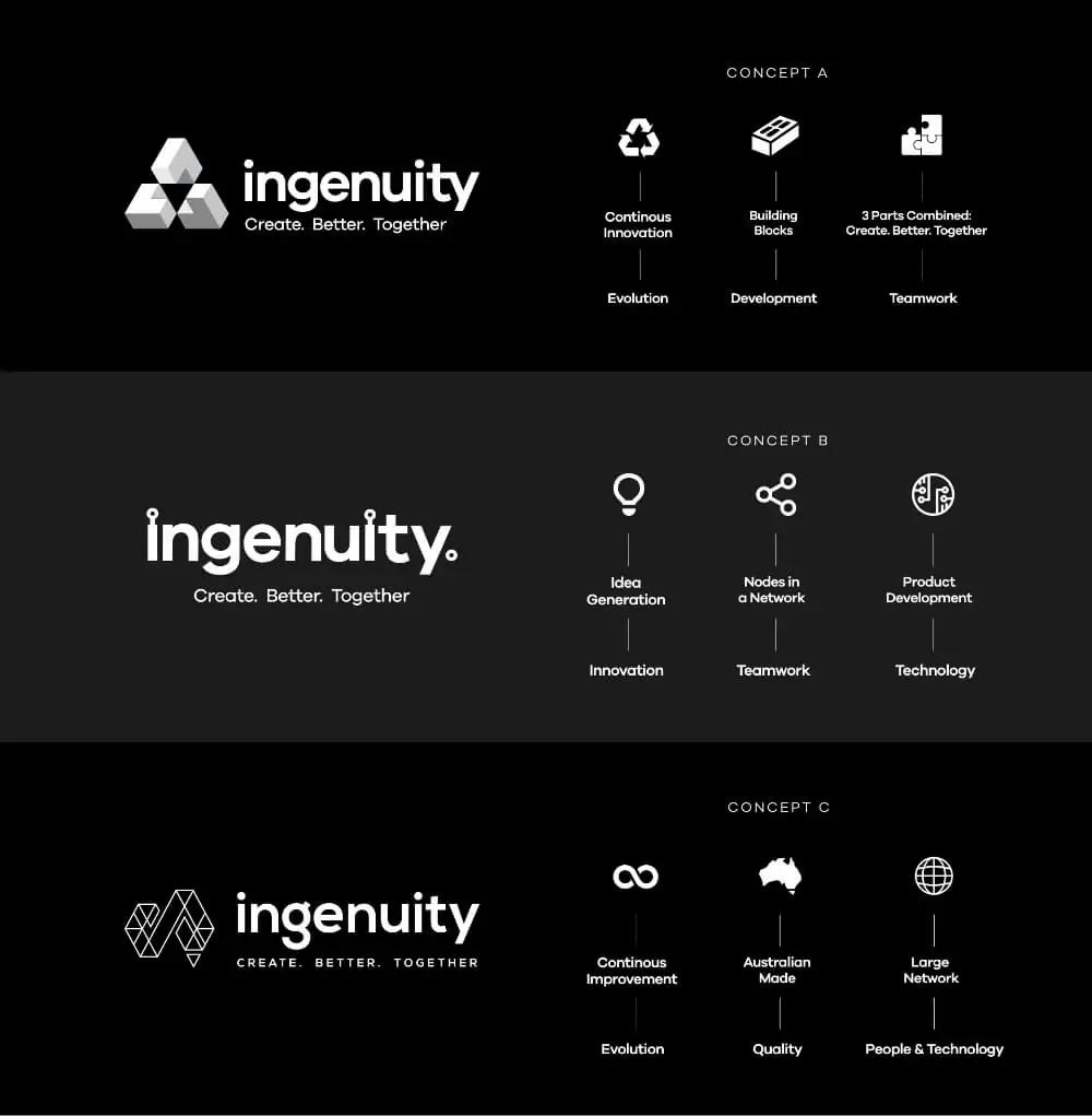
Below are three of our initial design concepts for Ingenuity’s new logo and the thought process which brought us to the results.
Whilst they are quite different in style they all meet the brief in a different way, which we have communicated visually using iconography. Common themes throughout these designs which tie back to our original checklist are the companies innovative products and service offering, and the importance of communication and teamwork to Ingenuity, and their expanding global network.

- Three initial design concepts we created for consideration.
Phase Five: Refinement & Revisions
Armed with our initial concepts, we were ready to pitch our ideas to the client. In order to showcase our work, the design department sat down for another meeting with Paul and his team.
Each concept was presented one at a time in the form of high-quality PDFs.
Within each document, we share how the logo will look on light and dark backgrounds, horizontally and vertically, mocked up on products and stationery, overlaid on imagery or patterns, as well as the rationale behind our design decisions.
As we run through our ideas, we encourage an open and honest dialogue about how each logo may work for their business.
Although there is always research and rationale behind the designs we pitch, not every mark will resonate with the client.
It is important to remember when discussing these ideas that the most critical requirement for our logo is that it meets the needs of the business and ticks the boxes of simplicity, distinctiveness, and appropriateness. Therefore, wherever possible feedback should always be related to whether or not it meets these goals, rather than personal and subjective likes and dislikes.
With that in mind, we aim to present multiple design directions rather than placing all of our eggs in one basket. It is rare to hit the nail squarely on the head first time, so this initial round of feedback is where we are honing in on a preferred design direction.
Our goal is to select one of our three options that resonate most with the client, and will most successfully steer them towards their goals. We can then put this logo under the spotlight, encouraging any critique and feedback that will help direct us towards our final mark.
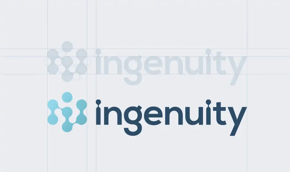
Paul’s top choice from our initial presentation was concept two.
He liked the simplicity of this wordmark, and how the nodes above each letter ‘i’ formed a subtle reference to their specialism in the electronics field.
We tweaked colour profiles from their original branding which enabled Ingenuity to maintain some brand recognition, and with a thumbs up on this and the general feel of the typography, we had an excellent basis on which to begin fine-tuning.
Although they liked the simplicity of a wordmark logo, Paul felt it might be beneficial to incorporate a symbol which they could use as an icon throughout their branding. There was also a desire to maintain the essence of the mark that we had created, but to place more emphasis on people, teams, networking, and the human-centric nature of the business.
The font choice from concept three had also caught their eye, so we aimed to utilise this in our next set of concepts. This first round can be an excellent opportunity to pick up on the strongest elements of each idea, and where possible, work them into a better and cohesive logo.
- Above is a diagram of the steps we took on our journey from the initial concept, to our chosen design.
Phase Six: The Final Logo
With a clear design direction and only small adjustments to make, we were now gaining momentum, and beginning to close in on our final logo.
Our team created a simple, modern and organic symbol that resembled the nodes and network that was important for Paul and his brand. Where possible, it is a good idea to tie a symbol in with the name itself. We achieved this by maintaining the links above the ‘i’ but styling them to match the nodes from our icon. These also formed subtle portraits of people.
We also switched the font for the preferred typography style of our initial concept three.
After updating our presentation and mockups to ensure everything looked and worked well, we received the stamp of approval from Paul.

- The final logo concept for Ingenuity.
Once a final mark is approved, our design team will then package it up ready to use in any application. We provide all of our logos in CMYK and RGB colour profiles for use in print or digital, positive and negative for placement on light or dark backgrounds, and presented in a logo style guide which includes information on the fonts and colours used.
This style guide helps a business direct any current or future design decisions, maintaining consistency with their logo across all brand collateral.
We also provide our final logo files in different file formats; JPEG, PNG, PDF and EPS.
Each suited to a unique set of applications, having all of these files at your disposal ensures best results, no matter what the requirements.
To wrap up the Ingenuity identity design project, we went on to create them a detailed brand guidelines document. Much like the logo style guide, we designed this to guide both internal and external design decisions that relate to the companies brand and identity.
However, where the logo style guide only includes details about the logo itself, the brand guidelines document directs how the company would present itself at every touchpoint.
From the website to social media, to advertising and stationery design, this comprehensive document covers every application of the new Ingenuity branding.
Armed with this, Ingenuity should not only look it’s very best at all times but will remain on brand and consistent in everything they do.
- The new Ingenuity brand should be consistent across everything it touches.

Conclusion
Although a logo may seem like a small and insignificant piece of the puzzle when considering where to invest time and money in a business, it is a crucial piece that can prove costly to overlook.
When done correctly, a well-designed logo is a real asset which can benefit short and long-term success, as well as the businesses bottom line.
At the end of the Ingenuity identity design project, both Paul and our team were delighted with the final result.
Through our thorough process of internal design work and collaboration with the client, our initial ideas evolved into a clean, distinctive, and unique logo which we feel can carry Ingenuity forward on their path towards global expansion and success.
Ben and Chris, from our team of talented in-house designers, really enjoyed the Ingenuity project and the opportunity to work with such an enthusiastic, thought-leading, and technology-driven business.
Chris, our branding specialist, took the lead on this logo design, drawing on his many years of training to craft a mark that ticked all of Ingenuity’s boxes.
Chris even runs a business of his own specialising in logos, Red Kite Design, bringing all of this experience to the Excite Media design team.
If you would like Excite Media to help build you a brand that will guide your business towards success, chat to us today to get the ball rolling