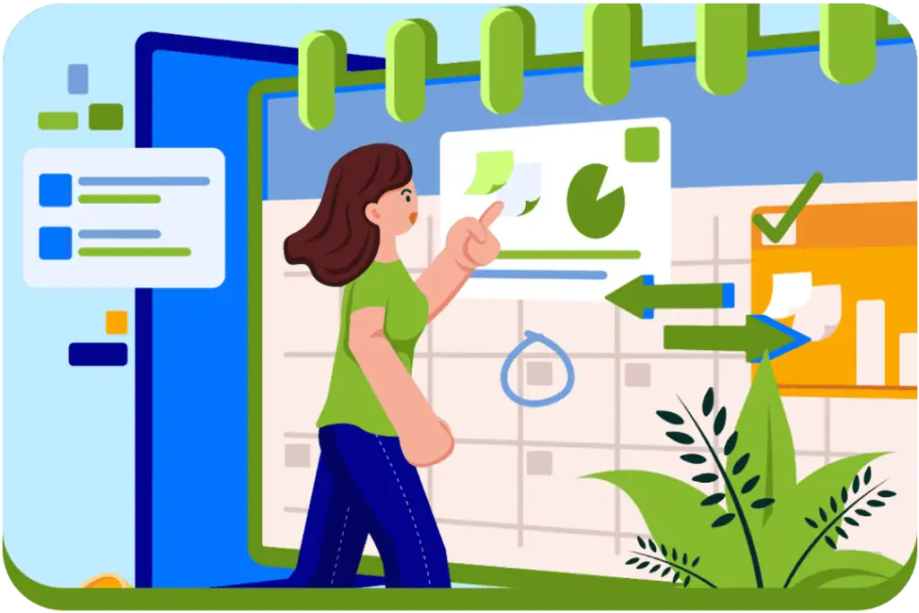
Calendar integrations are one of those features that feel like an obvious improvement to your business. If someone is interested enough to be on your website, surely making it easy for them to book straight away is the smartest move, right?
Over the years, I’ve seen this logic drive countless website decisions, particularly in health, allied health, and service-based businesses. A “Book Now” button promises efficiency, automation, and usually, fewer admin headaches. In theory, it is designed to remove any barriers and increase conversions. But it’s actually a whole lot more complicated than that.
We’ve seen calendar integrations work well in the right context, but they can also slow things down. Often, it’s less about the tool itself and more about timing, intention, and what a first-time visitor is actually ready to do
Table of Contents
ToggleTL;DR (Too Long; Didn’t Read) 👇
- Most first-time visitors are still figuring out if they’re in the right place and if your service feels right, not looking to take immediate action.
- What looks like a simple next step from your side often feels like a time, money, and information commitment from theirs.
- An enquiry form lets people engage without locking themselves in, giving them space to ask a question or show interest first.
- When people feel heard and supported early on, booking tends to feel far easier later because trust has already started to form.
- Some people arrive ready to book, others need clarity first, and a good customer journey should have room for both.
The common mistake we see time and time again
Recently, a client emailed asking whether she should add a “Book Now” button to her website, linking directly to her Zanda (formerly Power Diary) booking system. Her reasoning was something we’ve heard many times before: if someone is already on the site and clearly interested, why not remove the extra step and let them book immediately?
It’s hard to argue with that on the surface. Fewer clicks, less admin, and an automated process that feels like it should move people more quickly from interest to action. A few years ago, I would have said yes without thinking twice and added the button.
Nowadays, I hesitate a little more. Not because I think these tools don’t work, but because I’ve seen the same pattern play out more than once.
Not long before this conversation, another practice owner had made that exact change. She removed her enquiry form and replaced it with a direct online booking link. Everything else stayed the same. Traffic didn’t dip, services didn’t change, and there was no obvious external reason for what happened next.
Her weekly enquiries? Dropped from fifteen new clients to just two.
When she reached out, it wasn’t about a bug or technical issues. She was genuinely confused and frustrated, saying her online calendar has been a “complete disaster.”
But nothing was actually broken. The booking system was doing exactly what it was supposed to do. The problem was assuming that booking was the right first step for every new visitor, regardless of how ready they were to commit.

What you’re really asking people to do when they book
Now, I’m a big fan of a metaphor, so in this case, I like to compare it to proposing on the first date. Imagine you’re meeting someone for the first time, you’re having a good conversation and getting to know each other, and then suddenly they ask you to make a serious commitment on the spot.
Too much, too soon? Exactly.
That’s pretty much what happens when a new visitor lands on your website and the only option is to make a booking. From a user’s perspective, booking isn’t the single click most people think it is. It often includes:
- Pulling out their calendar
- Committing to a specific time
- Entering personal details
- Paying a deposit or upfront
For someone who is already uncertain, anxious, or still gathering information, that jump can feel intimidating. And when people feel pressured, they rarely push through and commit. More often, they move on to somewhere that feels more comfortable.
Don’t underestimate the power of an enquiry form
One of the most common misconceptions I see is that enquiry forms create friction, while booking calendars remove it, when in reality it’s often the opposite, particularly for first–time visitors. An enquiry form provides a low-pressure way for someone to raise their hand without forcing a decision they may not be ready to make. It lets them ask a question, express uncertainty, or simply say, “I’m interested, but I need a bit more information.”
This interaction is a great way to build trust. It sets expectations, opens a conversation, and reassures people that there’s a human on the other side of the process. For many services, especially those involving personal circumstances, health, or vulnerability, reassurances matter far more than a speedy booking process.
When enquiry forms are done right, they don’t slow things down. They create momentum that naturally guides people to convert. Over time, we’ve seen that businesses that prioritise early-stage communication tend to see stronger engagement, higher-quality enquiries, and better long-term outcomes, even if that first step appears slow on the surface.

The approach we keep coming back to
After testing this across different businesses and industries, one thing has become pretty clear. When the first step on a website feels approachable and low-pressure, people are far more likely to engage, and once that engagement starts, bookings tend to naturally follow.
When the opposite happens, and the first interaction asks for a big commitment, enquiry numbers tend to drop, even though the service itself hasn’t changed. We’ve found it’s rarely a demand issue, but more so a timing issue.
The fix: a simple 5-field form for new enquiries
These days, we keep coming back to the same setup because, time and time again, it just works. There’s nothing fancy about it, but that’s part of the point.
Here’s what we recommend:
1. A short enquiry form with five fields
This gives people enough room to explain why they’re reaching out without feeling like they’re committing to something too big. It’s an easy first step for someone who’s interested but not quite ready to lock anything in.
2. Clear, reassuring messaging about next steps
Something as simple as letting people know when they’ll hear back helps remove uncertainty and shows there’s a real person on the other side who will follow up.
3. Adding booking options to the thank-you page
One thing that we’ve found works really great is having the calendar/booking widget on the enquiry thank- you page. That way, you’ve already got their details, and the client can make their own decision if they are ready to book after the initial low-obligation enquiry (we find that many people do!). This way, it feels a lot less obligatory than having the enquiry form first.
An optional client portal or booking link for returning visitors
Returning clients usually just want an easy way to book again. Having a client portal or booking link there for them, without making it the main focus, keeps things simple for everyone.
What we’re currently testing
Right now, we’re playing around with a more relaxed setup on a few practice websites. New visitors are gently pointed toward an enquiry form, while a “Book Now” option is still there for anyone who already knows they’re ready to book.
The idea isn’t to steer people in a particular direction, but to give them an easy choice. Some people land on a site ready to lock something in straight away. Others just want to ask a question or get a bit more comfortable first, and that’s completely normal.

Start by understanding intent before asking people to act
Now, I’m not saying that calendar integrations are the enemy. In the right context, they can be incredibly useful. But they’re not always the right starting point, especially for first-time visitors.
If your practice management software’s booking form is currently the main way people can get in touch, it’s worth taking a step back and thinking about what you’re really asking someone in that moment. Are they ready to commit, or are they still figuring things out?
In many cases, people just want a gentle way to start the conversation. They want to know they’re in the right place, that they’ll be listened to, and there’s a clear next step without uncertainty.
Sometimes, making it easier to book actually means making it easier to reach out first.
Need a hand understanding what’s working and what’s not on your site?