



Every year, web design agencies, CRM publications, and other industry thought leaders throw together articles about the year’s latest web design trends.
Usually, these are new takes on old trends, a new way to design content, or innovative ways to create a better experience for your visitors. Sometimes, they really are just about making the page pretty — but they still count.
Some of these trends remain for years, like sticky headers and hamburger menus. Some come and go, like colour gradients (spoiler: they’re still going strong). And others are just short-lived, like sliding banners (still a no-go, still no sign of resurgence).
But nowadays, your website isn’t just being designed for humans; it’s also being designed for the AI tools that sit between your business and your customers. More on that shortly.
You can’t necessarily predict which trends will go the distance and which will fall by the wayside. What you can do is be thoughtful about how you use and implement them, and make impact, purpose, and convertibility a big priority.
Let’s take a look at some of the web design trends shaping the modern era of design, and how they affect convertibility.
Table of Contents
ToggleTL;DR (Too Long; Didn’t Read) 👇
- Not every trend suits every brand, so pick trends deliberately based on what fits your business rather than applying them all just because they are popular.
- Speed and mobile-first design directly drive conversions. Slow or poorly optimised sites lose visitors and search rankings fast.
- Websites now need to be readable by AI, not just humans. Clear structure and FAQ-style content help AI search tools understand and recommend your business.
- Reducing friction and distraction increases conversions. Clean layouts, personalisation and accessibility all make it easier for visitors to find your message and act on it.

Before we start, it's important to note that not every trend will work for every website
There’s no need to note down every trend and immediately apply it to your website — nuance is definitely key. If you’re a law firm or a business specialising in chartered accounting, we’d probably ditch the quirky typeface and illustrations.
This is even more important nowadays. With AI making it easy to churn out generic, samey-looking sites, the brands that stand out are the ones making deliberate, considered choices, not the ones ticking off every trend on the list.
Responsive (and mobile-first) design
We wouldn’t necessarily call this one a trend, because it’s 100% here to stay. But the bar has moved.
Responsive design is where your website responds to different devices and screen types. The page adjusts to fit a desktop, mobile, or tablet, and things like menu items might get bigger when a finger is required to click rather than a cursor.
Mobile makes up the clear majority of web traffic, so “responsive” isn’t enough on its own. The best sites are designed mobile-first and then expanded out to desktop, rather than the other way around.
How does it boost conversion?
Responsive design is all about creating an excellent experience for the people who land on your website. By making sure anyone can access your site from anywhere, you lower your bounce rate and boost both the number of visitors you get and the time they spend with you.
It’s like they say — you’ve gotta be in it to win it.
We’re well and truly in a mobile-first world now, so your website needs to work beautifully on a phone as the baseline, not the afterthought. Get this right, and you’ll see better results on Google and better results on your website.
Speed and "zero-wait" experiences
If there’s one trend that’s quietly doing the most for conversions in 2026, it’s raw speed.
“Fast” used to be a nice-to-have. Now the expectation is closer to instant. When a page lags, hesitates, or makes someone wait, they don’t think “slow internet”; they think “this business doesn’t have its act together.” Slow feels careless. Instant feels premium.
Google’s Core Web Vitals, which measure load time, interactivity and visual stability, are now a genuine ranking signal. Speed is not just a UX issue; it affects visibility too.
How does it boost conversion?
The numbers here are hard to argue with. Studies consistently show that more than half of mobile visitors will abandon a site that takes longer than about three seconds to load, and that every extra second of load time can shave several per cent off your conversion rate.
The fix is to build performance in from the start rather than bolting it on at the end: optimised, modern image formats, lean code, and no plugin bloat. A fast site keeps people around long enough to actually convert, and it helps your ads and your SEO work harder too.
Designing for AI search
Here’s the one that wasn’t really on anyone’s radar a few years ago. More and more people are starting their search not on Google, but inside AI tools like ChatGPT, Perplexity, Gemini, Copilot, and AI-assisted browsers. Google itself now shows AI-generated answers at the top of a lot of searches, so people often get their answer without ever clicking through to a website, which is exactly why those little visual details matter more than ever.
You know those little logos you see next to a website’s name, or the preview image and title that pop up when a link gets shared? That’s your favicon and Open Graph image. When an AI tool shows your website as an answer or a source, that little logo and preview are often the only thing someone sees before deciding whether to click. A clean, recognisable one stands out. A blank or generic one just gets skipped.
And even when people don’t click at all, that’s often the only piece of your brand they see. So getting these small visual details right is how people start to recognise and remember you, even in a search result they never actually visit.
Minimalism (the considered kind)
Minimalism in web design is just that: a minimalistic design. Less is more, and that’s absolutely true when it comes to your web page.
Where minimalism in interior design means a bare-bones yet considered space, minimalism in web design is all about keeping the use of elements down and making sure the ones you do use are well-considered.
The cleanest sites are also leaning into warmth and personality with original photography, a bit of hand-crafted illustration, a distinctive typeface, so they feel human rather than sterile. Minimal, but not generic.
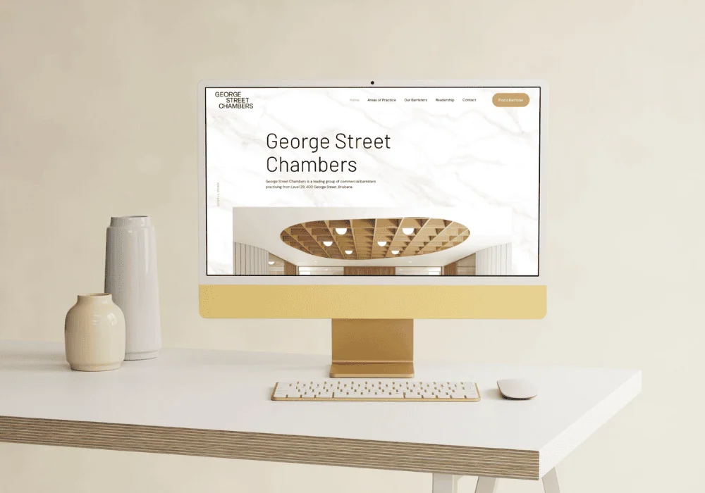
Here’s a minimalistic web design we created for George Street Chambers.
How does it boost conversion?
Each page on your website has a message; usually the unique selling point of your business, or the benefit of choosing you. The more elements on a page, the more your message has to compete against.
We’re not saying the key to conversion is a black-typeface message on a white background and calling it a day. But by limiting distractions and being thoughtful in your layout, you make it easy for visitors to find what they need and make your message loud and clear.
Particularly for professional services, these designs build trust while also feeling sleek and sophisticated. Plus, a lean design loads quicker, which, as we previously mentioned, is another box ticked by Google.
Bento grids and asymmetrical layouts
If you’ve noticed more websites laying out their content in neat, modular tiles, a bit like a Japanese lunchbox or an Apple product page — that’s a bento grid, and it’s the defining layout of 2026.
Instead of one long, linear scroll, content is organised into distinct blocks of different sizes that can be read in any order. It’s a close cousin of the asymmetrical layout: the design is still deliberate and balanced, but the uneven, modular arrangement creates points of interest and lets you show a lot without it feeling cluttered.
As with all asymmetry, this one isn’t for every brand, and done poorly, it can look messy so it needs a considered hand.
How does it boost conversion?
Bento grids work because they match how people actually read websites nowadays: nonlinearly, skimming for the bits that matter to them. You can size and place the tiles to draw the eye straight to your most important messages and calls to action.
They’re also brilliant on mobile. The tiles simply reflow to stack neatly rather than breaking the layout. So you get a design that’s both eye-catching and genuinely functional across every device, which is exactly the combination that keeps people moving toward your “Contact Us” page.

Bold typography
Web designers are still loving a bold typeface, and it makes sense. It’s a brilliant way to boost the impact of individual words and messages on your website — and your conversion rate with them.
This is getting increasingly more expressive, with kinetic (animated) type and variable fonts that flex and adapt across screen sizes. It’s essential, of course, that bold type stays legible and is used sparingly.
How does it boost conversion?
By boosting the visual impact of certain elements and messages, you boost your conversion rate. Use bold words and headings to draw attention to the most important things on the page, and to marry your branding with your web design.
These subtle points of difference help visitors understand the page better and make their way toward taking action.
Gradients and creative colour patterns
A gradient is where two colours start on opposing sides and meet in the middle, creating a point of interest in backgrounds and design elements. It’s a pretty neat way to work your brand’s colours into your site, and creative colour patterns with fun, unique shapes do a similar job.
The colour palette has changed over the years, and we’re now moving away from the cool greys that dominated the early 2020s toward warmer, more inviting tones. Think soft terracottas, warm browns, greens, and lavenders, nice right?
Here’s a bright-coloured design we created for Free Folk Agency.
How does it boost conversion?
Visual appeal matters in web design, and the fun incorporation of colours in your website’s design achieves just that.
Obviously, it’s important that these are used in a way that is true to you and your brand — there’s no need to introduce a bunch of new colours that don’t go with your brand in the slightest.
3D elements and illustrations
Sometimes you don’t have photography, or it doesn’t make sense to hire a pro. And sometimes stock photos won’t cut it either.
When used well, illustrations and 3D elements can create a serious impact in your design and how your site converts.
A quick word of warning: Heavy 3D and WebGL can hammer your page speed, so it has to be balanced against performance.
There’s also a real edge right now in original, custom visuals. As AI-generated imagery becomes everywhere and a bit samey, hand-crafted illustration and professional photography help a brand feel distinctive and trustworthy.
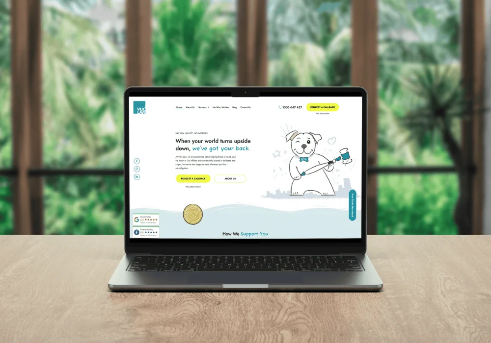
Here’s an illustration-based website we created for Vilic Law.
How does it boost conversion?
Illustrations can simply be a handy visual aid in lieu of photography. But for complex products or services, they really earn their keep by explaining how something works and simplifying concepts that would otherwise be hard to grasp.
For products that aren’t complex but where photos won’t quite work, illustrations can create an emotional connection or set the tone for your business. Even simple touches like arrows or footsteps guiding visitors down the page can boost conversions, and it’s even better when they’re animated, which brings us to…
Micro-animations and interactions
Told you we’d get to animations.
Ever moved your cursor over an element on a website and made it react? Pretty cool, hey? These are micro-animations, and while they might seem like a trendy way to beef up a page, they can actually have an effect on how your website performs.
In 2026, the smartest use of motion is as feedback rather than decoration. Think of a button that responds, a form field that confirms it’s been filled correctly, or even a subtle loading indicator. It reassures people and makes the whole site feel a bit more responsive and alive.
How does it boost conversion?
These tiny animations make a website feel more responsive and interactive, and they tend to keep users on the page longer, which earns SEO brownie points and helps people feel comfortable with your site.
Just like illustrations and gradients, they can guide visitors down the page toward your call to action. Basically, they create a fun, engaging experience that often seals the deal and gets your visitors to convert.

AI-driven personalisation
A newer one that has the entire design industry in a chokehold is websites that adapt to the individual visitor. That might mean a headline, hero image, or call-to-action that automatically changes to match someone’s industry, location, or what they searched for, or even a navigation that anticipates where they’ll want to go next.
A quick, honest note: personalisation leans on visitor data, so it needs to be done carefully and in line with privacy expectations. Done respectfully, though, it’s powerful (and in my opinion, very fun).
How does it boost conversion?
Because people pay attention when something feels like it was made just for them. The more relevant a page feels, the less work the visitor has to do to connect the dots, and the more likely they are to take the next step.
Personalisation helps remove those little moments of friction that make people hesitate. Instead of serving everyone the same generic message, you can show content that lines up with their needs, interests or where they came from.
And the best part is that you don’t need to personalise the whole website. Even small, smart touches, like matching a landing page to the campaign that brought someone there, can make the journey feel clearer, quicker and much more clickable.
Accessibility-first design
Accessibility has well and truly moved past “nice to have”. Things like proper colour contrast, keyboard navigation, readable text and alt text are becoming basic expectations, with accessibility standards carrying more legal weight too.
How does it boost conversion?
Because an accessible site is usually just a better site. Clear text, strong contrast and a logical layout make life easier for everyone, not only people using assistive technology.
When visitors can actually read, navigate and understand your site without getting annoyed, they are much more likely to stick around and take action.
There is a handy SEO bonus too. The same clean structure that helps screen readers understand your content also makes it easier for Google and AI tools to work out what your pages are about.

Book a free website strategy session
Review your website with Andrew to find out what you can do to improve it. Walk away with a list of recommendations to convert customers on the spot.


