How we built this brand from the ground up
MAW Money is a mortgage broker founded to bridge the gap between customers and the big banks. Headed by Mark Williams, the business is about bringing a different voice to the lending industry.
We absolutely love getting to build a brand from the ground up, so we were stoked when Mark came to us with MAW Money.
Table of Contents
ToggleIt all started with the branding 🎨
The Brief
Mark was heading off on holiday at the beginning of the campaign and said, “You guys are the experts so I will leave it to you.”
He had a few ideas in mind from the beginning. He knew he wanted to play on his brand name, MAW → more.
He knew he liked the idea of a “greater than” symbol (>) being incorporated.
And he really liked how a competitor had used purple in their branding, separating them from the big banks.
So, it was a pretty light brief. Our brand wizard, Chris, started with a big brainstorm.
He started with a mind map of words and topics related to MAW Money and mortgage broking.
House, home, mortgage, finance, graphs, results, progress, up arrows, the “greater than” symbol.
Using all those inspiring words, he brainstormed a bunch of logo-friendly symbols. He sketched out a bunch of quick ideas in ProCreate, then took the cream of the crop to Adobe Illustrator.
Crafting a logo using his skill and experience, Chris trialled colour palettes, found the perfect typography for each logo, and developed three different brand concepts for Mark.
The Concepts 💡
When it comes to something like a logo, it’s important we get it right. The best way to do that isn’t to just send off one logo and ask, “thoughts?”
By developing three different concepts, you will have a better idea of what you like and what you don’t, with the ability to compare and contrast.
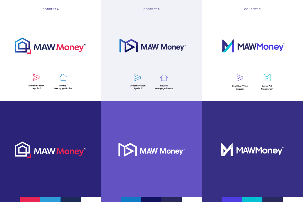
Chris decided to create two concepts incorporating a home and one that played on the M in MAW. Two of the designs were “safer” concepts, using that typical ~financial~ colour palette.
One of the concepts using the home though, also played into that idea of separating MAW Money from the banks, by mixing pink into the palette.
“As a general rule of thumb when I’m designing logos, I try to keep them as simple as possible whilst still meeting the brief and being distinctive,” Chris explains.
“This means they are generally a lot more versatile and lend well to any application, and can be used in different ways,” he said, pointing to the arrow in the website’s header.
Looking at the three concepts, you’ll notice there are three sub-concepts within each. It’s really important your logo has these different variations so it can adapt to different uses.
A white logo won’t work on a white or light-coloured background, so we need to have alternatives ready.
What we landed on 🥁
Da da da daaaa. Here’s what we landed on…
Mark was totally smitten with the first concept, “Wow! You have nailed the brief, and I really like the first design!”
“The colours are on point, royal blue looks prestigious and the bubble gum pink in the small > than symbol and Money look modern and slick! Also, the house within a house symbolises growth.
“Lock it in!”
And yeah look, we agree 😉
What it became ✨
When you’re not an experienced designer, it can be kind of tricky to try and visualise how these designs translate to all the other spots they need to go.
There’s business stationery.
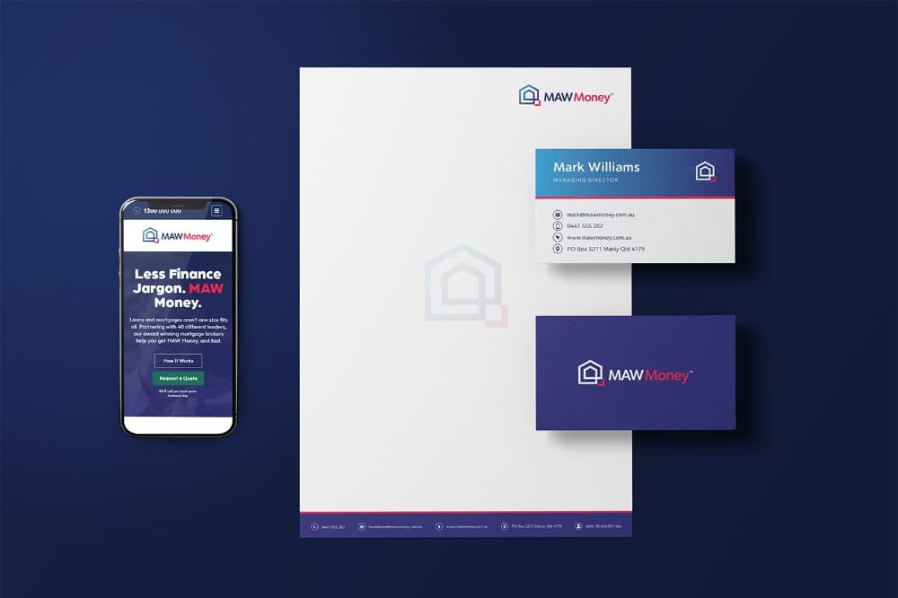
There are social media assets.

And of course, there’s the website.

Then we needed on brand, conversion-ready copy ✏️
A brilliant brand and a stunning website are cool and all, but it’s the copy that engages your visitors, makes them like you, and convinces them to act. (Yes, a copywriter wrote this too 😋)
Our copywriter, Laura, interviewed Mark to get all the best bits and pieces of his brand out of him.
Together they workshopped a bunch of ideas. Mark knew he wanted to play on the MAW in MAW Money.
The idea of the gap in finance came up. Mark talked about how big banks make lending convoluted and confusing and how MAW was different, MAW was here to make it simple, uncomplicated, and a little bit fun.
So we developed the tagline “Less Jargon, MAW Money” — summarising exactly what Mark’s target market is looking for.
It was so important we carried that value and that messaging throughout the copy as well though.
So, we used simplified language, we referenced and quipped confusing finance terms, and created a tone of voice that’s all about being authoritative but equal at the same time.
“Fixed-rate, variable, LMI, LVR — you can stop studying the jargon. At MAW Money, we’re all about uncomplicating finance, so you can spend more time dreaming about your property instead of stressing out about acronyms.”
It was time for the website to come together
Firstly, we teamed up with MAW to map out a homepage
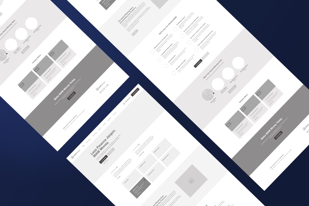
Each of our website projects starts with a kickoff meeting. At our kickoff meetings, we have one goal — create a confirmed and approved wireframe of the homepage.
If you’re wondering what a wireframe is, it’s basically the bones of a page. It has dummy text, black and white shades only, and grey boxes instead of images.
It’s the simple way to work out exactly how we want a page to be laid out, without the distraction of choosing the best images, colours, or getting the copy just right — because that isn’t the point at this stage.
This way, we can make absolutely sure we have all the ingredients we need to attract a website visitor, engage them, and then convert them into a MAW Money customer.
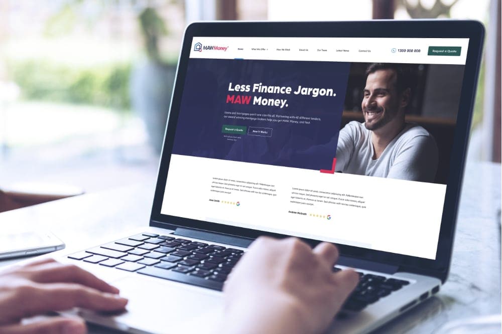
First design concept
With the branding knocked out of the park, the copy raring to go, and a confirmed homepage structure, we were good to go! Our web designer Jordie transformed the wireframe into a real-life design, skillfully incorporating Chris’ branding throughout. You can see how that dash of pink and the “greater than” symbol in the logo translated into the website design.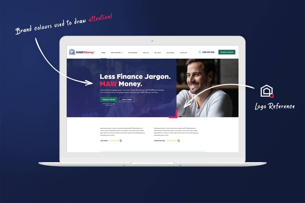
Those little hints in the branding are what highlights the important bits of copy, re-engaging the user when we need them the most.
Mark approved the design first go 🎉